What is the most common visual mistake in low-budget projects?
Have you ever wondered why some independent projects look incredible while others look «cheap» despite having a good camera? The answer usually lies in an unfairly forgotten department: art direction.
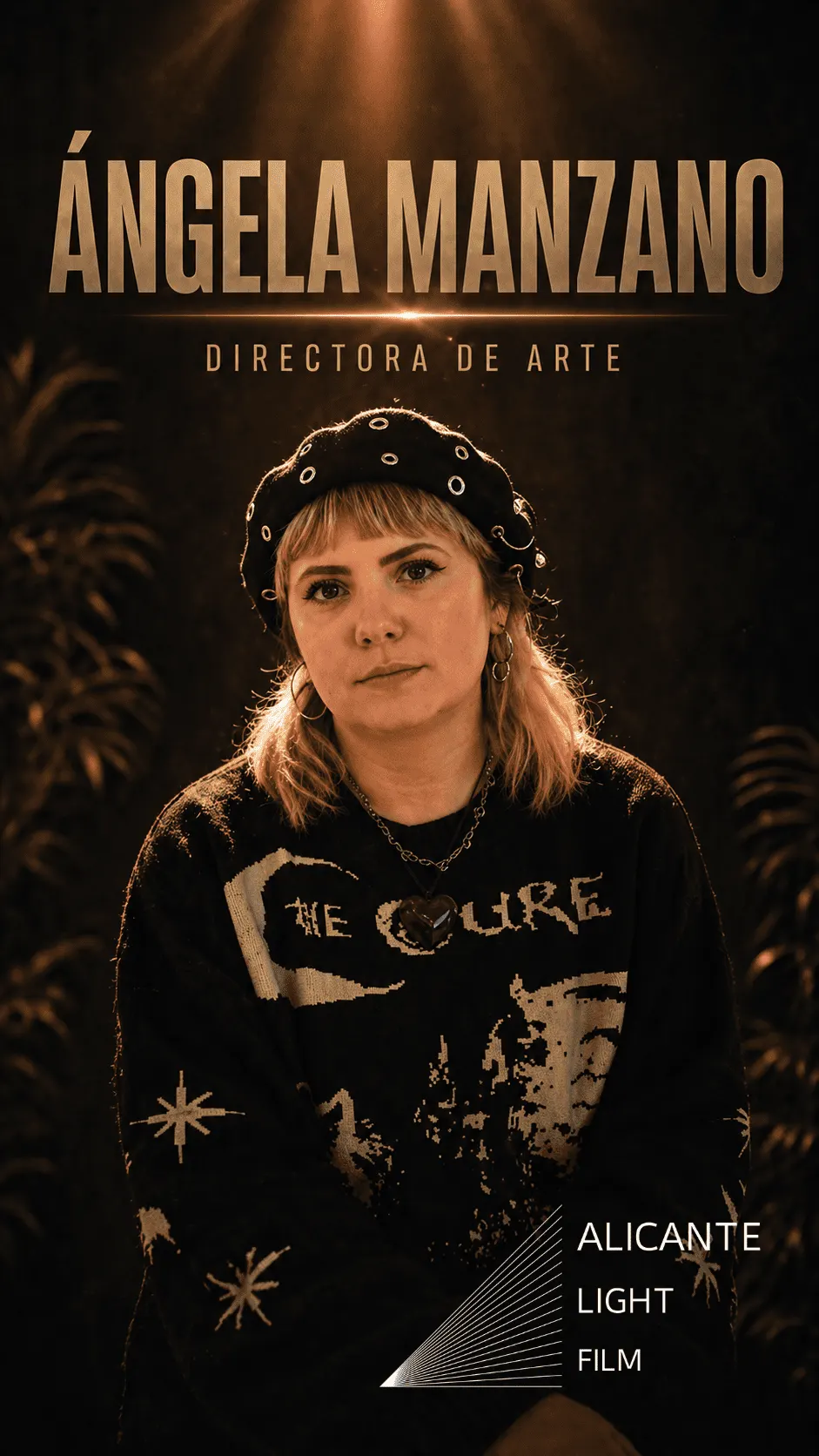
Expert Ángela Manzano highlights the most common visual mistake in independent film: thinking of art as a decorative extra rather than the foundation of the image.
Many filmmakers make the mistake of leaving the whole look to cinematography or post-production. But the camera can only capture what is in front of it. If the space doesn’t tell a story, no lens, however expensive, can fix it.
Ángela points out two critical mistakes that break the magic of film:
- Empty spaces: perfect lighting is not enough if the set has no soul. Production design is what gives depth and truth to every shot, through objects and how they are arranged.
- Relying on colour grading for everything: you cannot expect the camera’s colour to solve everything if the textures and colour palette of the set have not been worked on from the design stage.
Your best ally for saving money (and looking good)
On tight budgets, art direction is not an optional expense but your best ally for multiplying production value. A set that has been worked on properly from the production design stage brings consistency and professionalism, allowing a small project to compete visually with top-level productions.