The invisible language: why the colour palette is the soul of your art direction
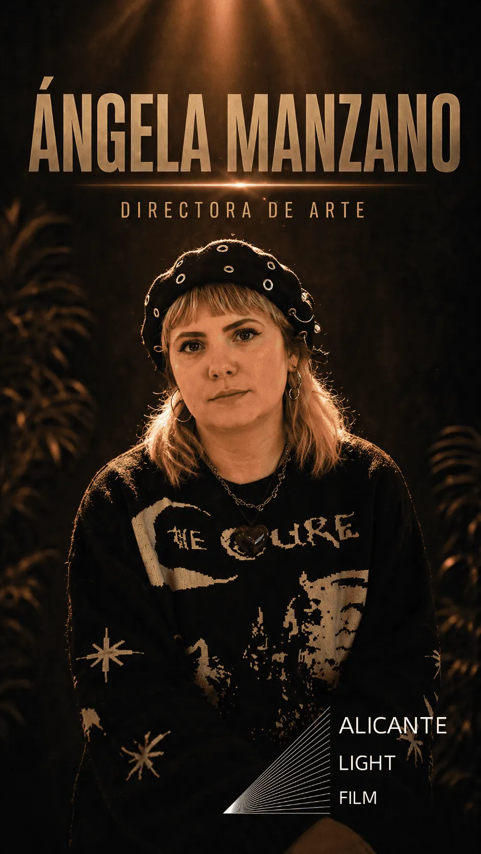
Has a shot ever completely gripped you without you knowing exactly why? We often look for the answer in the camera or a well-placed light, but art direction expert Ángela Manzano points to the most underrated element of the image: the colour palette.
In our latest tip, Ángela reminds us that colour is not an aesthetic whim or something to «decide on the fly» on set. It is actually the silent language that builds the emotion of your story.
The most common mistake is thinking that art is about filling the space with attractive objects. But Ángela has a much deeper view: colour is pure psychology.
- It speaks about the story: before an actor says their first line, the audience is already receiving information. Cold, desaturated tones put us in a different mood from a warm, vibrant palette.
- It provokes feelings: production design uses colour to manipulate (in a good way) how the audience perceives things. Colour can instantly create tension, calm, nostalgia or danger.
Visual consistency as a storytelling tool
When the colour palette is worked on from the script stage, the project gains a visual consistency that takes it to the next level. Ángela insists that underestimating this means losing one of the most powerful tools for connecting with the audience.
If colour does not support the emotion of the scene, you are wasting a golden opportunity to make your storytelling complete.
Production design doesn’t just «dress» the shot; it gives it intention. Next time you plan a shoot, don’t just ask which camera you will use; ask what you want the audience to feel, and let the colour palette do the rest.
Have you ever stopped to think about the emotional meaning of the colours in your favourite scenes?